How to Choose the Right Paint Color for Any Room

A fresh coat of paint is one of the cheapest, easiest ways to transform a home — and one of the easiest decisions to get wrong. With endless colors and finishes to choose from, picking the right one comes down to a handful of factors most people don't think to check before they buy the can.
Start With What's Already in the Room
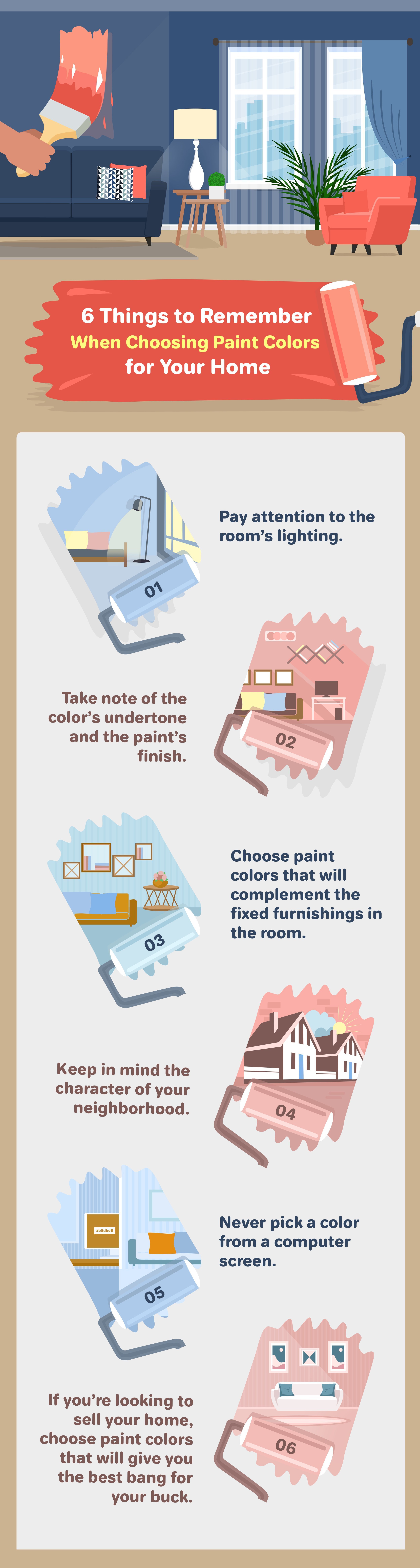
Your new color needs to work with what's already there — flooring, countertops, cabinetry, tile, and any fixed furnishings you're not replacing. If the room is mostly neutral, a bold, saturated color can create a nice statement. If the room already leans bold and busy, a more neutral hue balances things out rather than competing with it. If you have a piece of art or furniture you're building the room around, make sure your paint choice enhances it rather than fighting with it. This matters especially in kitchens and bathrooms, where cabinetry and countertop colors are the most expensive things in the room to change.
If you're mid-renovation and haven't finalized your furnishings yet, consider a neutral, versatile color — paint is far cheaper to redo than furniture, so it's smarter to wait than to lock in a color you might regret once everything else is in place.
Light Changes Everything — Literally
The color you fall in love with at the paint store will not look the same on your walls, because of one factor stores can't replicate: your room's actual light.
Natural light and room direction matters more than people expect. A room that gets a lot of sunlight can handle bold, saturated colors without feeling overwhelming. A room with less natural light often does better with something lighter. Check which direction your room faces:
North-facing rooms get less direct sunlight and tend to read cooler — compensate with warmer paint tones so the space doesn't feel cold.
South-facing rooms get the most consistent light throughout the day — cooler tones tend to look vibrant without feeling overly energetic.
East-facing rooms get their strongest light in the morning — a warmer palette helps offset dimmer evening light if that's when you use the room most.
West-facing rooms get a warm glow at sunset — cooler paint tones help tone that down if evening is prime time for the space.
Artificial light matters just as much. Fluorescent bulbs run cooler and enhance blues and greens. Incandescent bulbs cast a yellow glow that favors warm colors — reds, oranges, yellows. LED lighting is the most flexible and works reasonably well with most paint colors. Halogen lighting most closely resembles daylight and renders color the most accurately. Turn on whatever light sources the room will actually use before you commit to a color, and if you're mid-renovation, install your lighting before you paint, not after.
A Little Color Theory Goes a Long Way
Understanding the basics of color theory — the color wheel, complementary and analogous colors — gives you a framework instead of guesswork. Warm colors (reds, oranges, yellows) tend to feel cozy and energetic. Blues and greens tend to feel calming. Neutrals (whites, grays, beiges) provide balance and versatility, and they're the safest choice when you're not sure how a room's other elements will evolve over time.
Undertones and Finish Matter More Than the Swatch
Every color has an undertone — a subtler secondary tone that's easy to miss on a small paint chip but becomes obvious once it's on a full wall next to your flooring, countertops, and lighting. A color that looked perfectly neutral in the store can suddenly read pink, green, or yellow once it's up. Paint finish matters too: matte finishes tend to be cheaper but less durable and harder to clean, while glossier finishes hold up better to cleaning but show more imperfections in the wall underneath.
Never Trust a Screen, and Don't Trust a Tiny Swatch Either
Colors render differently on every monitor, so picking a paint color from a photo or website preview is a reliable way to be disappointed. Get physical color chips or samples from the paint store instead. Better yet, skip the one-inch swatches entirely — get larger sample sheets or a small sample jar, paint a real section of the wall, and look at it throughout the day under the room's actual lighting before committing to a full room.
If You're Choosing Colors to Sell
If you're painting to prepare your home for sale, the calculus changes slightly — you're not just choosing a color you love, you're choosing one that appeals to the widest range of buyers. One widely-cited color analysis from Zillow found that certain colors were associated with meaningfully higher (or lower) sale prices in specific rooms — a navy blue front door, for instance, was linked to a sale price several thousand dollars higher than expected, and pale blue to periwinkle bathrooms performed particularly well. "Greige" (a gray-beige blend) outperformed straight brown or tan tones in living spaces, and neutral tones with warm undertones tended to outsell colder, starker choices. On the flip side, yellow kitchens and all-white bathrooms were linked to lower-than-expected sale prices in that same analysis.
Take the exact dollar figures with a grain of salt — buyer preferences shift, and that data is a few years old at this point — but the underlying principle holds up: broadly appealing, warm-neutral tones tend to perform better with buyers than bold or polarizing color choices, especially in kitchens and bathrooms.
Also worth keeping in mind if you're painting the exterior to sell: check the character of your neighborhood and any HOA guidelines first. A facade color that clashes with the surrounding block can hurt curb appeal more than it helps, no matter how much you love it.
Ready to Get Your Home Show-Ready?
Whether you're refreshing a room for yourself or prepping to list, we can help you figure out which updates are actually worth the investment.
Give us a call at 904-503-0672 or email info@crossviewrealty.com. You can also learn more at crossviewrealty.com.
Frequently Asked Questions
Q: How do I choose a paint color that will actually look good in my room? A: Start with what's already in the room — flooring, cabinetry, furnishings — and check the room's actual lighting (both natural light direction and artificial bulb type) before committing. A color that looks great in the store can look completely different once it's on your walls under your specific lighting.
Q: Does the direction my room faces affect what paint color I should choose? A: Yes. North-facing rooms get less direct light and read cooler, so warmer paint tones help. South-facing rooms get consistent bright light and can handle cooler tones. East-facing rooms are brightest in the morning; west-facing rooms get warm evening light — choose your palette based on when you use the room most.
Q: What paint colors help sell a home? A: Broadly appealing, warm-neutral tones tend to perform best with buyers, especially in kitchens and bathrooms. A widely-cited Zillow color analysis found navy front doors, pale blue-to-periwinkle bathrooms, and "greige" living spaces all associated with higher-than-expected sale prices, while yellow kitchens and all-white bathrooms underperformed. Treat the exact numbers as directional rather than current fact.
Q: Should I test paint colors before painting a whole room? A: Yes — skip tiny paper swatches and get larger sample sheets or a small sample jar. Paint a real section of wall and observe it throughout the day under the room's actual lighting before committing to the full room.
Q: What's the difference between matte and glossy paint finishes? A: Matte finishes are generally cheaper but less durable and harder to clean. Glossier finishes hold up better to cleaning and wear but tend to show more imperfections in the wall surface underneath.